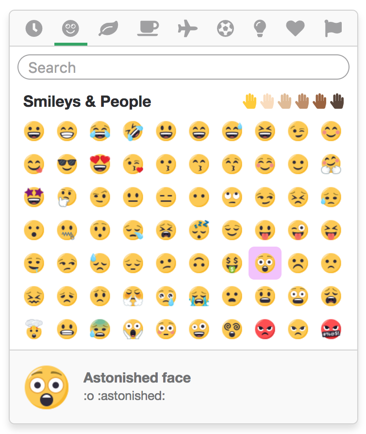
Emoji picker
A React based emoji picker powered by Interweave and Emojibase. Supports the following features:
- Customizable theme, styles, and icons.
- Configurable element and render order.
- Localized emoji labels and annotations.
- Emoji grouping and categorization.
- Multi-word deep search.
- Skin tone palette selector.
- Variation gallery selector.
- Enlarged preview on hover.
- Emoticons and shortcodes.
- Recently and frequently used.
- Virtualized rendering.
- And much more!
Slack and Twitter themes provided as an example of the library's robustness.
Requirements
- React 16.8+ / 17+
- Interweave + Emoji
- Emojibase
Installation
- Yarn
- NPM
yarn add interweave interweave-emoji interweave-emoji-picker emojibase
npm install interweave interweave-emoji interweave-emoji-picker emojibase
Usage
To utilize the emoji picker, import and render the <EmojiPicker /> component. The picker renders
in place, so any positioning or display toggling should be done manually.
import { EmojiPicker } from 'interweave-emoji-picker';
<EmojiPicker emojiSize={24} emojiLargeSize={48} emojiPath={getSvgPathForEmoji} />
The sizing and path emoji props are required. View the TypeScript interface for a list of all available props.
Allow and block lists
Sometimes specific emojis should not be used, like the poop emoji. This can easily be achieved with
the blockList prop, which accepts an array of hexcodes.
<EmojiPicker
    blockList={[
        '1F4A9', // poop
        '1F52B', // gun
    ]}
/>
The inverse, the allowList prop, can be used for situations where a restricted list of emojis
should only be used. This also accepts an array of hexcodes.
// Only trees
<EmojiPicker
    allowList={[
        '1F332', // evergreen
        '1F333', // deciduous
        '1F334', // palm
        '1F384', // christmas
        '1F38B', // tanabata
    ]}
/>
Not sure where to find a hexcode? Dig around Emojibase.
Commonly used
When an emoji is selected (clicked on), we keep a history known as "commonly used", and display a
custom group within the emoji list. This history has two modes, recently used and frequently used,
and can be customized with the commonMode prop. Selected emojis that fall past the
maxCommonlyUsed prop are trimmed from the history.
recently-used- Tracks selected emojis from most recently selected to oldest.frequently-used- Tracks selected emojis using a counter, in descending order.
<EmojiPicker commonMode="frequently-used" />
The commonly used feature can be disabled with the disableCommonlyUsed prop.
Commonly used emojis are stored in local storage.
Changing appearance
This picker is quite customizable, if not the most customizable, when it comes to its visual appearance. Every aspect of the picker can be changed, whether it be the order of elements, hiding or showing elements, the number of emojis to render, and more. I'll try to keep this rather short.
To change the number of visible emojis rendered in the list, define the columnCount and rowCount
props.
<EmojiPicker columnCount={15} rowCount={5} />
To change the default selected group tab or skin tone palette, define the defaultGroup and
defaultSkinTone props respectively.
<EmojiPicker defaultGroup="food-drink" defaultSkinTone="medium" />
By default, the picker renders elements in the following order: emoji being hovered preview at the
top, followed by the list of emojis, the search bar, and the group tabs. This order can be changed
with the displayOrder prop, which accepts an array of strings.
<EmojiPicker displayOrder={['groups', 'search', 'emojis', 'preview']} />
To disable one of the elements mentioned previously, pass a disableGroups, disablePreview,
disableSearch, or disableSkinTones prop.
<EmojiPicker disableSearch disableSkinTones />
To hide emoticons or shortcodes within the preview, pass the hideEmoticon or hideShortcodes
props. Furthermore, to hide group headers (but still use group tabs), pass hideGroupHeaders.
<EmojiPicker hideEmoticon hideGroupHeaders />
Customizing icons
To customize the icons displayed in the group tabs, pass an object of nodes to the groupIcons
(list)
prop. By default the picker uses native emoji but can render React components.
<EmojiPicker
    groupIcons={{
        activities: <IconBasketball />,
    }}
/>
Customizing styles
The picker is not styled by default as it allows consumers to easily customize the CSS to match their application. There are 2 approaches to styling the picker, the first by writing CSS that follows the class names provided by Interweave.
.interweave-picker__picker {
    position: 'absolute';
    bottom: 100%;
}
The second by writing CSS and passing an object of custom class names to the classNames prop. This
approach enables non-standard solutions, like CSS modules and CSS-in-JS.
<EmojiPicker
    classNames={{
        picker: 'picker-7sa92dsd',
    }}
/>
The emojiPadding prop is an exception to the CSS pattern, as it pads the emoji button using inline
styles. This is necessary for accurately computing of widths and heights.
<EmojiPicker emojiPadding={5} />
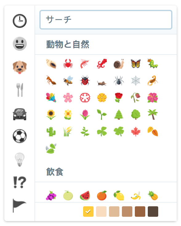
Translating messages
Localization is important, and thus, all messages within the picker can be translated with the
messages prop. This prop accepts an object of message keys to translated strings. The list of
available messages can be found here.
<EmojiPicker
    locale="ja"
    messages={{
        search: 'サーチ',
    }}
/>